White Bear Lake Area Educators Rebrand
Photo in header taken by David Jenkins, Caters News agency

Before
After
New Logo, Business Stationery, and Style Guide.
The White Bear Lake Area Educators are more than just a union full of teachers. They represent positive change for the district and deeply care about protecting both the students and the staff.
The association did not have much of a budget to work with, but as an alumnus of White Bear Lake High School, Michelle wanted to give back to the community she grew up in. The old logo was very low res, the acronym WBLTA (White Bear Lake Teachers Association) was not very clear to outsiders, and the bear looked quite sad. Since the union wanted to rename themselves to be more inclusive of all educators in their community anyways, they needed a new mark to represent themselves proudly within their local community.

In the new (and improved!) White Bear Lake Area Educators (WBLAE) logo, a calm, confident, proud bear represents how the White Bear Lake Area Educators are watching over their community. The bear is looking up into the stars as if thinking about the future of education for the district.
Each star represents the three main stages of education for students: Early Childhood, Primary and Secondary.
The serif typeface speaks to a more traditional-feel for the logo. Most textbooks, papers, etc. are printed in a serif font because it is generally easier on the eyes at a smaller size for large amounts of text. Therefore, it reminds people of education and years of studying textbooks.
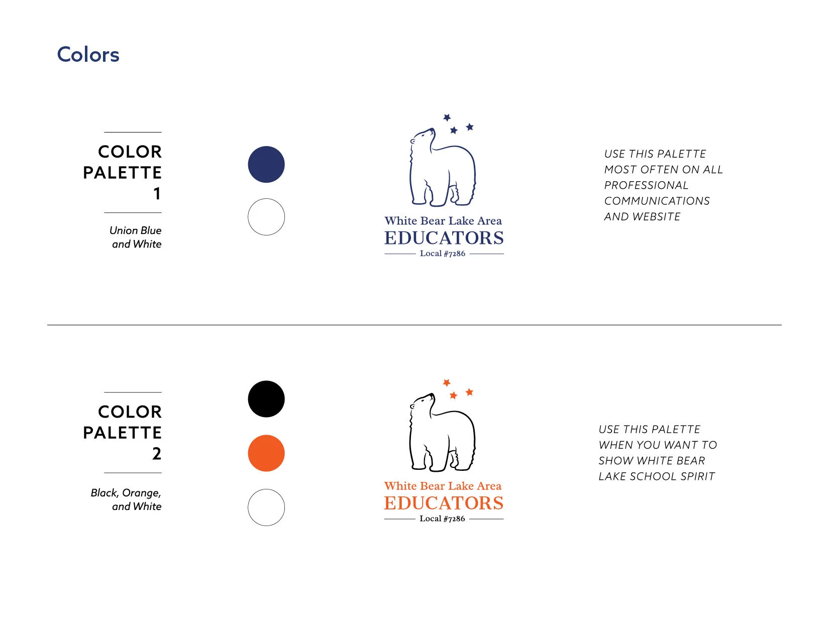
There are two different color palettes for the association to use in different situations. One is a dark blue to represent the stability and professionalism of the union. The orange, black and white is for use in school-related applications since those are the colors used for the white bear lake area school district and mascot (go bears!).
“MKR Design Studios … captured the personality and history of our organization…”
MKR Design Studios worked with my local teachers union to create a logo that captured the personality and history of our organization to honor the past while leading us into the future. They listened to our members, highlighting the emotional impact we wanted from our brand identity and provided us with a clear and thorough design document simple enough for any user to understand. I cannot recommend the work of MKR Design Studios enough.
— Troy, White Bear Lake Area Educators, 2020
Process Sketches


Style Guide